- Deonna Does AI
- Posts
- How to Build a Stylish, Custom AI-Generated Site
How to Build a Stylish, Custom AI-Generated Site
That doesn't look like every other bootstrap-y startup clone
Deonna Hodges
July 06, 2025
So here’s the deal.
Everyone’s shouting about how AI can build your whole site for you.
And yeah, it can. But most of those AI-generated sites look like they were designed by a committee of interns who just discovered Bootstrap.
You know the ones: hero text that says "Revolutionize your business" in gray-on-gray Inter. Blech.
Let’s not be like them.
I’m going to show you how to:
I built a site in a few hours this morning using v0.dev and a Canva screenshot. It’s for HelloTable, a little social experiment where six strangers meet over dinner.
$7 to reserve your spot, show up, get it back. No dating. No networking. Just good food, weird questions, and maybe a new friend.
Most AI sites look like they were factory-stamped with the same SaaS template. I wanted something that felt like a handwritten invite, not a CRM landing page.
Here’s how I did it. No Figma. No pixel pushing. Just a stolen vibe and some smart prompts.
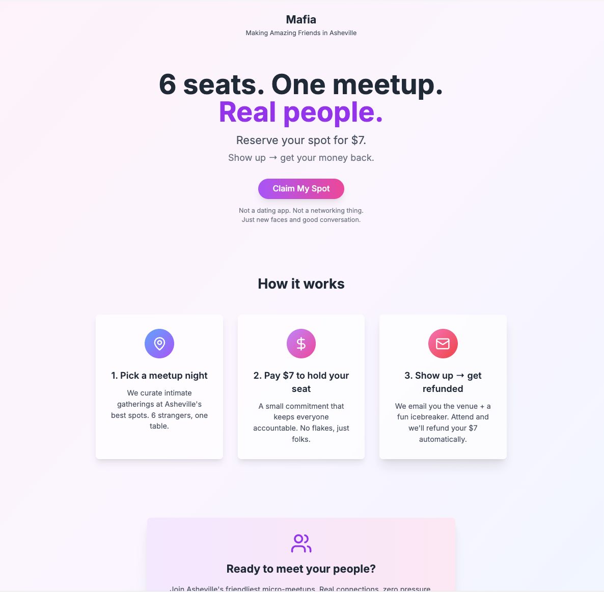
Before: mildly inviting.
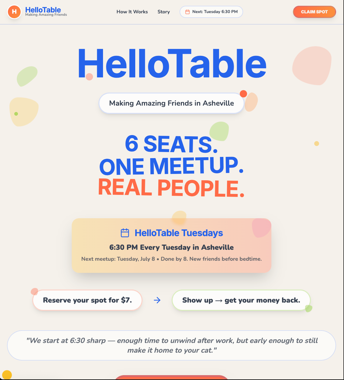
After: I’d cancel plans for this.
🎨 Step 1: Go Vibe-Hunting on Canva
Head to Canva. Start searching for inspiration: “event flyer,” “wellness landing page,” “portfolio,” whatever.
Scroll until something hits you in the gut like, Yes. I want my site to feel like that.
Cream background? Handwritten font? Orange daisy illustrations? Doesn’t matter. If it makes you feel something, that’s the one.
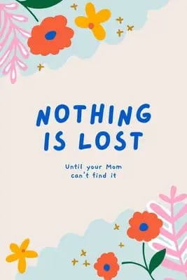
This low res mother’s day card became the inspiration for HelloTable
🕵️♀️ Step 2: Snag the Image
Right-click on the design and open Chrome DevTools (⌘ + Option + I on Mac).
Click on the design container and grab the direct image URL.
Or just screenshot it. You’re capturing the vibe essence, not high-res assets.
Save the image. This is your style guide now. Name it vibe.jpg and whisper sweet nothings to it.
🤖 Step 3: Go to v0.dev and Paste in This Prompt
Fire up v0.dev. Here's the magic spell:
Please redesign the site according to something that looks like this: color palette, typography update, etc. Then upload your vibe.jpg.
Let it cook. Give it a second. If it slaps, great. If not, hit “Regenerate” or nudge it with follow-ups like:
“Use more rounded corners and playful buttons”
“Make it feel more organic and warm”
“Stick to the font and spacing from the image”
You’re the creative director now. Trust your gut.
🧼 Step 4: Polish the Output (Optional, But Dope)
v0 gives you a React component. And it works…but it might be a little messy.
Like, "It’s functional but has inline styles and way too many divs" messy.
Here’s the fix:
Clean up the code, simplify class names, and keep all design elements from the original image.Boom. Now you’ve got clean code and aesthetic cohesion.
🧪 Step 5: Iterate Like a Weirdo
Try different image uploads. Feed it a neon movie poster. A photo of your favorite bodega mural. A moodboard you made while drinking an oatmilk matcha latte at 11PM.
I’ve personally found that v0 is surprisingly good at translating good design into React components. Even if it gets it wrong, it gets it wrong creatively.
Final Thoughts
This method isn’t about “efficiency.” It’s about style. It’s about skipping Figma, skipping Dribbble, and going straight from vibe to deployed site in a couple hours.
Most AI sites look the same because everyone starts with the same prompt and the same idea.
But when you feed v0 a mood, not just a task?
You get something that actually feels like you made it.
Try it out. Experiment. Make something weird.
And if you end up with a site that feels like “your brain on the internet,” I’d love to see it, so DM me.